
CHALLENGE
As one of the most influential listener-supported radio stations in the world, KEXP strives to inspire and engage Music Lovers, Artists, and the Arts Community. For this reason, they wanted to improve the engagement of listeners and donors, within the mobile app.
KEXP offers robust and diverse programming through live radio broadcasts, live performances, extensive archived shows catalog, as well as podcasts. All of these are available on the company website, however some are unavailable through the mobile app. I was tasked with developing a way of integrating all of their programming into the mobile app, as well as further improving the user experience.
PROCESS
Before getting started, I decided that the best approach for this project was the double diamond method. This method guided me to discover and define the real problems, so that I could weed out any assumptions and design solutions for actual frustrations.

DISCOVER
To kickstart the discovery phase, I prepared a research plan and set some goals to guide me through my research. I decided to focus on competitive analysis, a questionnaire, and user interviews.
Competitive Analysis: For the competitive analysis portion of my research, I decided to look at what type of programming was available, inside other non-profit radio stations mobile applications. Also, I wanted to analyze what features were available and how the information provided was organized.

Competitor Usability Testing: After reviewing the robust KCRW mobile app, and finding similarities with their programming to KEXP’s, I decided to conduct a brief usability testing using the KCRW mobile app. This would give me insight into the overall user experience, and the possible improvements that could guide the development of the KEXP mobile app. To test the tasks of finding a podcast episode, adding it to their feed, locating a song and opening it in Spotify, I performed usability testing with 3 individuals. The results from the testing were as follows:
100% of users found the overall interface clear, clean and easy to use.
All users liked how you could open shows and songs in Spotify.
Everyone liked how you could share from within the app.
They all also enjoyed that podcasts and music were available in the app.
Overall Complete Rate: 100%
Error-Free Rate: 100%
Questionnaire & User Interviews: Before scheduling user interviews and writing my interview script, I wanted to get quick feedback about how people use music listening apps, and what likes and dislikes they may have. I decided the best method for capturing that input, would be to send out a quick questionnaire. After receiving 42 responses, this questionnaire gave a great snapshot of current music listeners needs. These results helped guide my interview script and notes.
To gain further insights into the user experience, and any frustrations or pain points listeners may be running into, I decided to interview 3 individuals who were currently using the KEXP mobile app. Using my interview script as a guide, I spoke with each person, and took notes along the way. Afterwards, these notes were used to create an affinity map.

Affinity map created using my notes from user interviews.
DEFINE
During the synthesis phase, I created an affinity map, with my interview notes. This way I was able to group together similar themes and patterns, in order to gain insight into the users’ overall experience. Combining those with my competitive analysis findings, usability test findings, and the questionnaire results, I was able to define the following insights.
The KEXP app needs to be a little more robust, by allowing listeners to have some control over the songs and shows saved in their Favorites section.
Listeners would actively experience the podcasts if they were available in the mobile app.
Sharing songs isn’t necessarily a big priority, but all participants would like to do so from the app.
The Favorites Show section should also provide more options, besides just saving the name of the show itself.
How Might We: At the end of the synthesis phase, I developed a key HMV question, to guide me through the development phase.
How might we bring the great podcasts created by KEXP to their loyal listeners within the mobile app, while also giving more control to how they interact with their saved songs and shows, and revisiting previous shows and songs because the curated programming of the KEXP DJs are what keeps them connected, engaged and loyal.
To influence my decision making, during the design and ideation phase, I created a persona and a storyboard. I would refer back to these to remind myself of who I was designing this product for, and what problems we needed to solve.

Persona

Storyboard
DEVELOP
INTERACTIVE DESIGN
Task Flow Diagrams: Before moving into wireframes and UI development, I created task flow diagrams to illustrate the tasks of finding a podcast to play, how someone would re-listen to a saved song, then open it into their Spotify account.

Task Flows
WIREFRAMES
Using the task flows, research findings, and the current KEXP mobile app interface and UI patterns, I started sketching out how the navigation and UI would function for the new podcast section. Also, I needed to consider additional functions for replaying songs and opening them into another music listening app, like Spotify. The additional features needed to integrate seamlessly into the existing application design.


Now that I had a rough idea how the mobile screens would look, I started to build mid-fidelity wireframes to fine tune the design patterns and visual hierarchy being used.

Mid-fidelity wireframes for the KEXP mobile app added features.
DELIVER
UI DESIGN
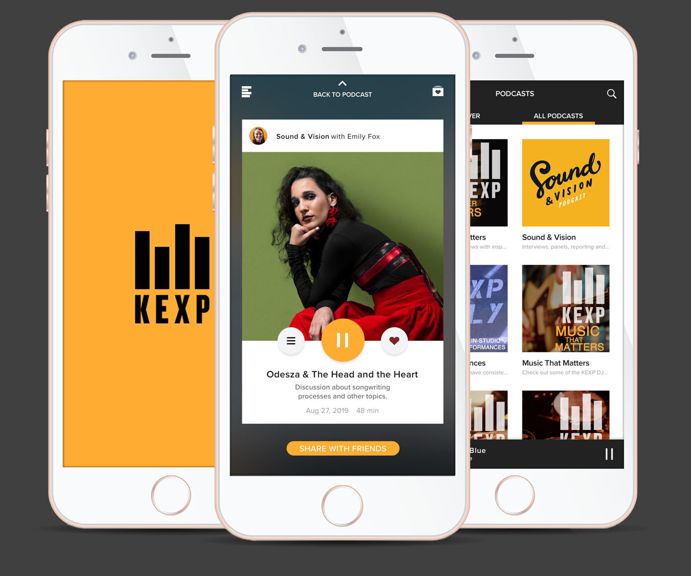
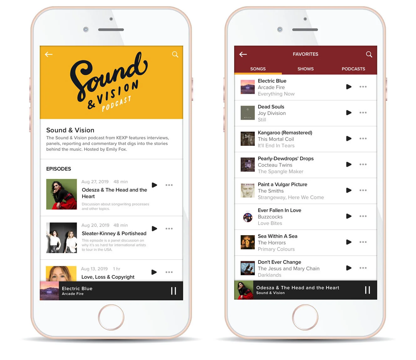
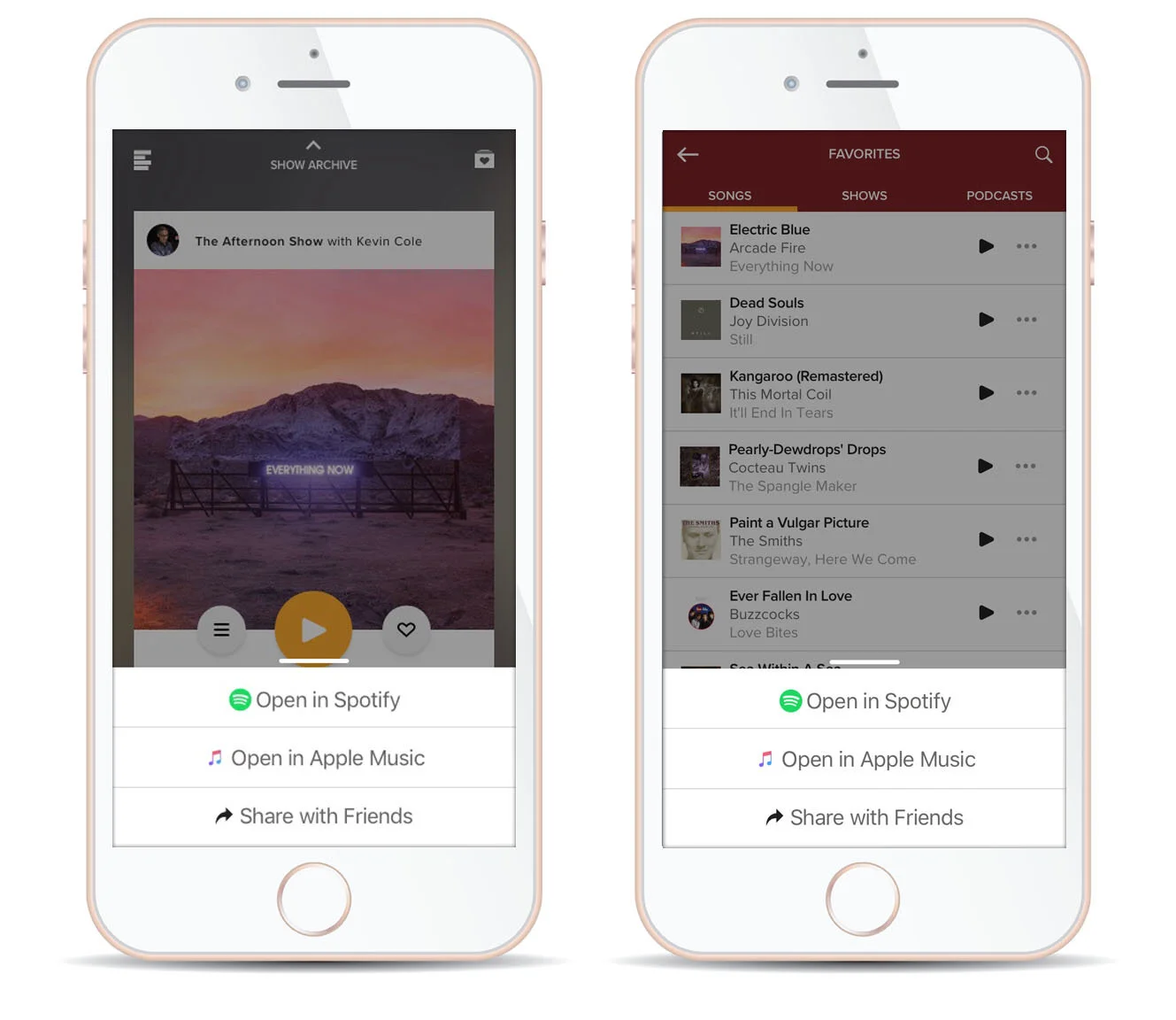
After designing the mid-fidelity wireframes, I moved into building a UI Kit, and applied those guidelines to build the KEXP hi-fidelity wireframes. The focus for this UI kit was to make sure that the new mobile screens matched, and would seamlessly fit within the existing design.

UI Kit for KEXP mobile app added features
Prototyping: The next step was building a prototype. Using InVision, I constructed the prototype from the high-fidelity wireframes that were uploaded through Sketch. This prototype was built to test the process of locating a podcast episode, add it to their favorites, locate a song from their favorites, share that song with a friend, and open that song in Spotify.
Usability Testing: To test how the user experience would be while perform the various tasks, I performed usability testing with 3 individuals. The results from the testing were as follows:
100% of users found the overall interface clear, clean and easy to use.
Everyone found the features of sharing with friends and opening into Spotify very helpful and convenient.
All users found the plus button a little confusing, and 2 users suggested the … icon.
All users liked having 2 different options for exploring the podcasts in the podcasts section.
Overall Complete Rate: 100%
Error-Free Rate: 100%
Taking the information gained from the usability testing, I made the adjustments to my high-fidelity wireframes.
Below is a gallery of the high-fidelity wireframes. Click through to review.


NEXT STEPS
Start to develop a feature for creating customized playlists.
Explore the addition of a social media feature within the mobile app.